实现网页变灰效果
了解
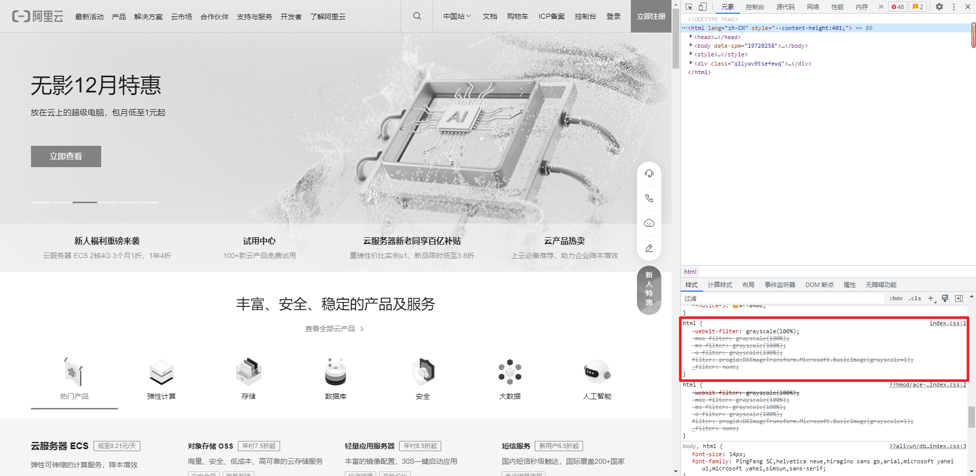
我们先来看看各大主流网站是如何实现这种效果的。
- 阿里云
- 腾讯云

- BiliBili

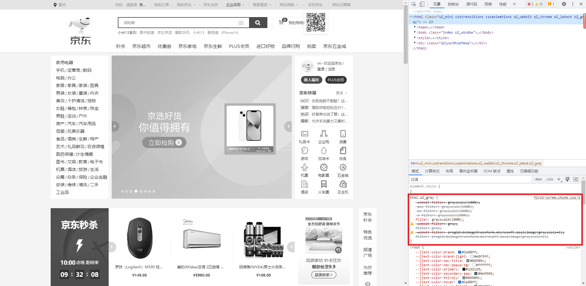
- 京东
- 淘宝

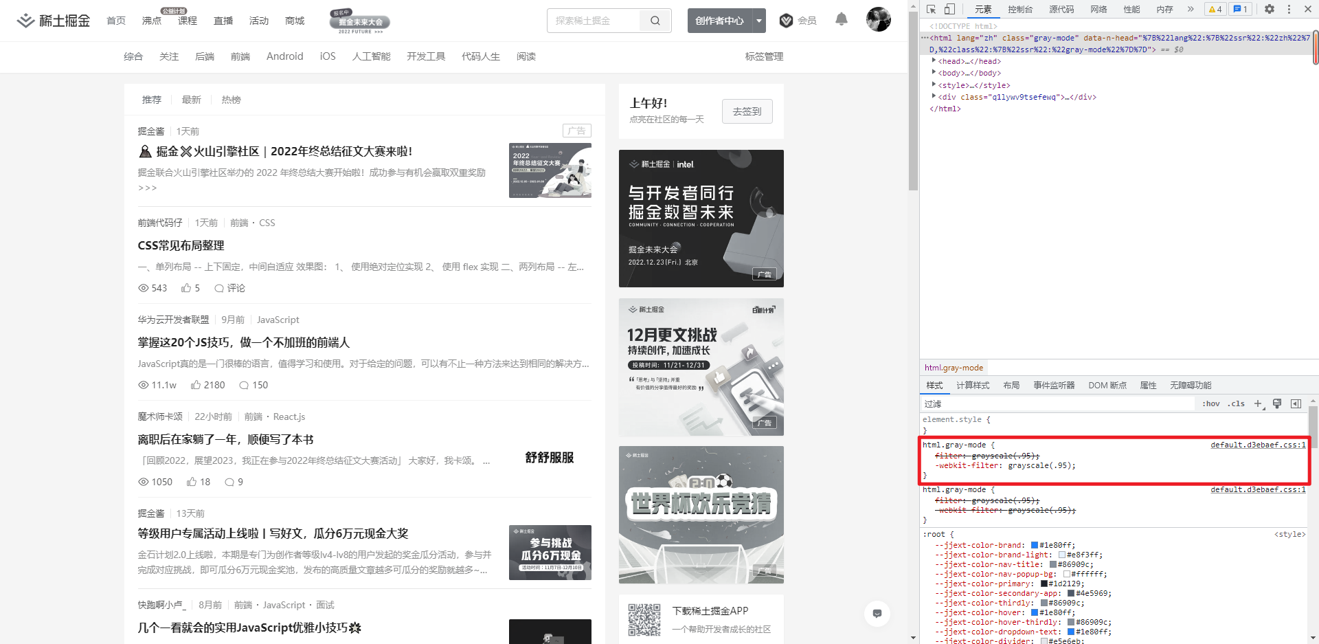
- 掘金
实现
我们可以发现它们实现的方式都是利用了 filter 属性。
CSS 属性 filter 将模糊或颜色偏移等图形效果应用于元素。滤镜通常用于调整图像、背景和边框的渲染。
综上所述,我们只要给页面的 html 设置这种样式即可变灰:
1 | html { |
我们还可以发现有些的代码写了很多行,比如京东。这是因为它对 filter 属性做了兼容。
完整版如下:
1 | html { |
扩展
filter 还有更多其他的属性:
1 | filter: blur() | brightness() | contrast() | drop-shadow() | grayscale() | hue-rotate() | invert() | opacity() | saturate() | sepia() | url(); |
这里就不一一介绍了,详情去前往 MDN - filter 查看。
本博客所有文章除特别声明外,均采用 CC BY-NC-SA 4.0 许可协议。转载请注明来自 LqZww's blog!
 微信
微信 支付宝
支付宝 QQ
QQ
相关推荐

评论
ValineLivere